
The goal was to concentrate brand communication on core values in order to elevate the brand’s positioning in the market. The aim of the strategic relaunch was to regain the brand’s former dominance in the market by returning to its essence. The brand had lost its essence, and a radical return to its preeminence was sought.
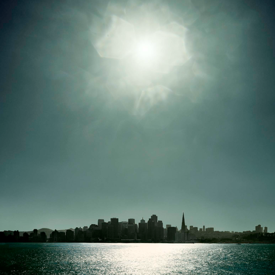
“The Star always shines from above”: A high-gloss product appears its brightest and most brilliant against a matte surface.
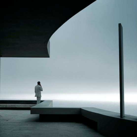
Translucent materials are used against a matte, internally illuminated concrete floor. Print materials start to glow in the darkness.
A crucial change was made to the brand’s color palette. It shifted away from silver, blue, and white to a subtle ecru, Cuban silver, and black. These tones, in combination, create a new warmth and reference the colors of car paints.
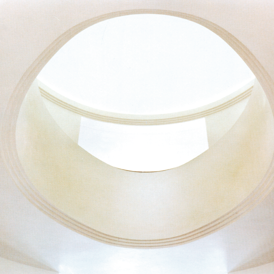
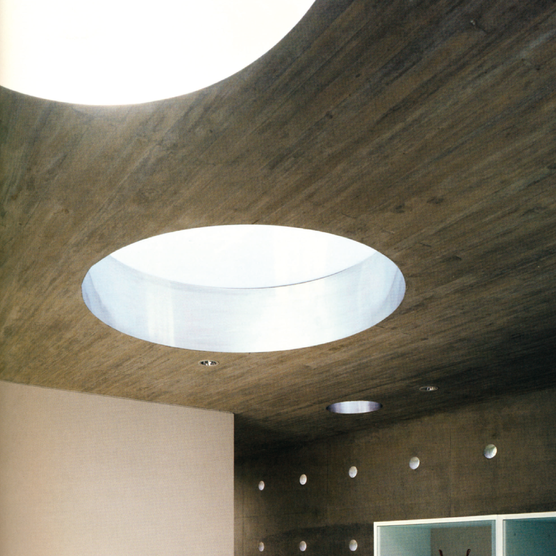
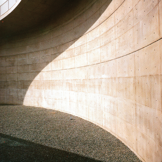
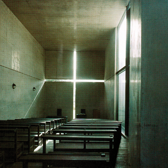
The concept behind the brand’s spatial presentation is that it uses only light “from above” as a way to translate the new slogan into the spatial brand. The surroundings of the cars are always matte in all applications. Rough wood, matte concrete. Only the products, the cars, shine and are illuminated from above.
And finally, the new Mercedes star: it shines from the inside.
In the advertisements, the brand mark has returned to being three-dimensional. However, this application can be easily recognised at Mercedes Benz Fashion Week, for example.
Mercedes Benz
brand workshop
analysis
brand vision
Brand Strategy
Corporate Identity Consulting
Corporate design development
Product development / Packaging
The goal was to concentrate brand communication on core values in order to elevate the brand’s positioning in the market. The aim of the strategic relaunch was to regain the brand’s former dominance in the market by returning to its essence. The brand had lost its essence, and a radical return to its preeminence was sought.
“The Star always shines from above”: A high-gloss product appears its brightest and most brilliant against a matte surface.
Translucent materials are used against a matte, internally illuminated concrete floor. Print materials start to glow in the darkness.
A crucial change was made to the brand’s color palette. It shifted away from silver, blue, and white to a subtle ecru, Cuban silver, and black. These tones, in combination, create a new warmth and reference the colors of car paints.
The concept behind the brand’s spatial presentation is that it uses only light “from above” as a way to translate the new slogan into the spatial brand. The surroundings of the cars are always matte in all applications. Rough wood, matte concrete. Only the products, the cars, shine and are illuminated from above.
And finally, the new Mercedes star: it shines from the inside.
In the advertisements, the brand mark has returned to being three-dimensional. However, this application can be easily recognised at Mercedes Benz Fashion Week, for example.
Post teilen:
Weitere Projekte

Contact us today to embark on the journey together, to build your luxury brand and transform it into a true icon of luxury – because true beauty resides in the details, and at Gesine Gold Branding, we specialize in uncovering precisely that beauty and communicating your quality and values, so that you can become a shining star in the premium and luxury segment!
We look forward to an informal initial conversation over a cup of tea in the living room of the Grandhotel Vier Jahreszeiten or simply a Zoom call with you.