
Gesine Gold was the Head of Design for the “Club der Besten” (Club of the Best) in 2004, working on the branding for the “Hamburg für Olympia” (Hamburg for the Olympics) bid. She was tasked with developing a comprehensive corporate design to convince the International Olympic Committee (IOC) that Hamburg was the best location for the Olympic Games. The branding aimed to motivate Hamburg’s citizens, politicians, and businesses to unite behind the Olympic spirit.
Enthusiastic, infectious, moving: Fired up for Hamburg! This guiding principle needed to be integrated into a comprehensive meta-concept to ensure its passionate element radiated through all communication forms. The developed design guidelines were conceptually aligned and cohesive.
The theme was: “The Olympic spirit is lived here daily. No city has as many renowned clubs with decades of tradition as Hamburg. For example, the world’s oldest gymnastics club, the second-oldest rowing club, the first German hockey and cycling clubs. Even as the Olympic Games continue to travel the world, Hamburg’s engagement and loyalty will ensure that the Olympic spirit lives on locally.”
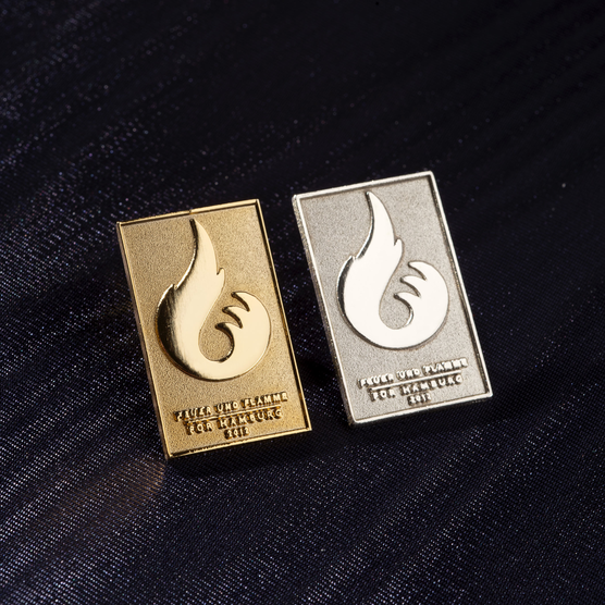
Creating the corporate design was a challenge. Simultaneously with the advertising concepts, it had to be completed on schedule and capture the “Feuer und Flamme” (Fired Up) motto. Various communication measures were developed within the “Club der Besten” team.
The color palette reflects Hanseatic tradition, symbolized by referencing Hamburg’s colors. However, the colors are harmonized, with neon orange as an additional color in the corporate design. The blue tone is reminiscent of dark blue Hanseatic men’s suits. Technical matte silver represents a visionary concept and establishes a modern connection. Thus, the color serves as a crucial contrast to the serif-emphasized and therefore traditional typography. The contrast between the cool, matte silver tone and the warm red and blazing neon orange intensifies the fiery enthusiasm, symbolizing the momentum of fervent passion.
Brand in space: The booth concept visually translates the “Feuer und Flamme” branding. Two-dimensional graphics and primary color schemes are applied in the three-dimensional space. Matte materials contrast with colorful high-gloss surfaces. Abstract torch lamps are integrated. Seating elements and the counter echo the dynamic shape of the logo.
The concept revolves around the interplay of lightweight, friendly elements, flags, and dynamic components. The booth is open to encourage maximum openness and an “invitation” to visitors. “Feuer und Flamme” as an experiential dimension. Red and blue light-changing systems can be employed. The presented concept is spatially flexible and modular. The corporate design and advertising materials have been largely implemented.
Hamburg for Olympia
Gesine Gold was the Head of Design for the “Club der Besten” (Club of the Best) in 2004, working on the branding for the “Hamburg für Olympia” (Hamburg for the Olympics) bid. She was tasked with developing a comprehensive corporate design to convince the International Olympic Committee (IOC) that Hamburg was the best location for the Olympic Games. The branding aimed to motivate Hamburg’s citizens, politicians, and businesses to unite behind the Olympic spirit.
Enthusiastic, infectious, moving: Fired up for Hamburg! This guiding principle needed to be integrated into a comprehensive meta-concept to ensure its passionate element radiated through all communication forms. The developed design guidelines were conceptually aligned and cohesive.
The theme was: “The Olympic spirit is lived here daily. No city has as many renowned clubs with decades of tradition as Hamburg. For example, the world’s oldest gymnastics club, the second-oldest rowing club, the first German hockey and cycling clubs. Even as the Olympic Games continue to travel the world, Hamburg’s engagement and loyalty will ensure that the Olympic spirit lives on locally.”
Creating the corporate design was a challenge. Simultaneously with the advertising concepts, it had to be completed on schedule and capture the “Feuer und Flamme” (Fired Up) motto. Various communication measures were developed within the “Club der Besten” team.
The color palette reflects Hanseatic tradition, symbolized by referencing Hamburg’s colors. However, the colors are harmonized, with neon orange as an additional color in the corporate design. The blue tone is reminiscent of dark blue Hanseatic men’s suits. Technical matte silver represents a visionary concept and establishes a modern connection. Thus, the color serves as a crucial contrast to the serif-emphasized and therefore traditional typography. The contrast between the cool, matte silver tone and the warm red and blazing neon orange intensifies the fiery enthusiasm, symbolizing the momentum of fervent passion.
Brand in space: The booth concept visually translates the “Feuer und Flamme” branding. Two-dimensional graphics and primary color schemes are applied in the three-dimensional space. Matte materials contrast with colorful high-gloss surfaces. Abstract torch lamps are integrated. Seating elements and the counter echo the dynamic shape of the logo.
The concept revolves around the interplay of lightweight, friendly elements, flags, and dynamic components. The booth is open to encourage maximum openness and an “invitation” to visitors. “Feuer und Flamme” as an experiential dimension. Red and blue light-changing systems can be employed. The presented concept is spatially flexible and modular. The corporate design and advertising materials have been largely implemented.
Contact us today to embark on the journey together, to build your luxury brand and transform it into a true icon of luxury – because true beauty resides in the details, and at Gesine Gold Branding, we specialize in uncovering precisely that beauty and communicating your quality and values, so that you can become a shining star in the premium and luxury segment!
We look forward to an informal initial conversation over a cup of tea in the living room of the Grandhotel Vier Jahreszeiten or simply a Zoom call with you.


