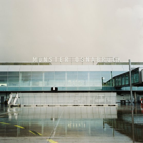

Rebranding of Münster Osnabrück Airport
‘An airport with a ZEN strategy.’
Creating a comprehensive, innovative, cosmopolitan, and above all timeless branding for an airport is a complex task. Gesine Gold achieved this for Münster Osnabrück Airport (FMO) through a differentiated “ZEN” branding strategy. This strategy encompassed brand analysis, brand strategy, fundamental conceptualization, creation of corporate design, magazines, advertising materials, image campaigns, and the direction of design aspects for the “Brand in Space” (Corporate Architecture) areas.
Over the decades, the airport had consistently expanded and become more technologically advanced. However, its corporate design and architectural implementation hadn’t evolved accordingly. With internationalization and the construction of a new terminal in progress, a complete rebranding was needed. The challenge was to create a confident and credible transition – from local to cosmopolitan.
A competition-differentiating theme and core of the new vision for all stakeholders was developed: “Fly Relaxed. Arrive Refreshed.” The Airport Münster Osnabrück offers short distances and an attractive environment, both in terms of landscape and architecture. It’s situated at the crossroads of major catchment areas.
The particular design challenge was to visualize the ZEN concept on various levels – to make it tangible, graphic, typographic, architectural, and create a cohesive image. A symbiosis was sought between sophisticated high-tech transportation logistics and the individual well-being of travelers and staff. The goal was to convey a sense of comfort for passengers, providing a counterpoint to the hectic pace of major airports.
Central design elements – color palettes, graphics, and typography – are crucial for achieving this desired balance. Color selection plays a pivotal role in intuitively and fundamentally establishing a mood that conveys relaxation, reliability, without surveillance, control, and rush. The aim was to create an overall “relaxed” impression through the interplay of various tones and harmonized color moods.
Two related shades of blue define the fundamental atmosphere: sky and expansiveness (destination desire). They evoke a sense of equilibrium, calmness, loyalty, royalty, and relaxation. The deep Western blue tone is balanced by a lighter Japanese blue tone, following the harmony principles of ZEN teachings, and made warmer and slightly transparent. These tones are combined with earthy brown tones and a metallic silver as an accent color.
Recognition: IF DESIGN AWARD in Silver for Innovation in Corporate Design
AIRPORT MÜNSTER OSNABRÜCK
Rebranding of Münster Osnabrück Airport
‘An airport with a ZEN strategy.’
Creating a comprehensive, innovative, cosmopolitan, and above all timeless branding for an airport is a complex task. Gesine Gold achieved this for Münster Osnabrück Airport (FMO) through a differentiated “ZEN” branding strategy. This strategy encompassed brand analysis, brand strategy, fundamental conceptualization, creation of corporate design, magazines, advertising materials, image campaigns, and the direction of design aspects for the “Brand in Space” (Corporate Architecture) areas.
Over the decades, the airport had consistently expanded and become more technologically advanced. However, its corporate design and architectural implementation hadn’t evolved accordingly. With internationalization and the construction of a new terminal in progress, a complete rebranding was needed. The challenge was to create a confident and credible transition – from local to cosmopolitan.
A competition-differentiating theme and core of the new vision for all stakeholders was developed: “Fly Relaxed. Arrive Refreshed.” The Airport Münster Osnabrück offers short distances and an attractive environment, both in terms of landscape and architecture. It’s situated at the crossroads of major catchment areas.
The particular design challenge was to visualize the ZEN concept on various levels – to make it tangible, graphic, typographic, architectural, and create a cohesive image. A symbiosis was sought between sophisticated high-tech transportation logistics and the individual well-being of travelers and staff. The goal was to convey a sense of comfort for passengers, providing a counterpoint to the hectic pace of major airports.
Central design elements – color palettes, graphics, and typography – are crucial for achieving this desired balance. Color selection plays a pivotal role in intuitively and fundamentally establishing a mood that conveys relaxation, reliability, without surveillance, control, and rush. The aim was to create an overall “relaxed” impression through the interplay of various tones and harmonized color moods.
Two related shades of blue define the fundamental atmosphere: sky and expansiveness (destination desire). They evoke a sense of equilibrium, calmness, loyalty, royalty, and relaxation. The deep Western blue tone is balanced by a lighter Japanese blue tone, following the harmony principles of ZEN teachings, and made warmer and slightly transparent. These tones are combined with earthy brown tones and a metallic silver as an accent color.
Recognition: IF DESIGN AWARD in Silver for Innovation in Corporate Design
Contact us today to embark on the journey together, to build your luxury brand and transform it into a true icon of luxury – because true beauty resides in the details, and at Gesine Gold Branding, we specialize in uncovering precisely that beauty and communicating your quality and values, so that you can become a shining star in the premium and luxury segment!
We look forward to an informal initial conversation over a cup of tea in the living room of the Grandhotel Vier Jahreszeiten or simply a Zoom call with you.


